
Shirts by Mike
E-Commerce Site
Personal Project
Project Type: UX Design, Website Design, and Responsive Design
Goals
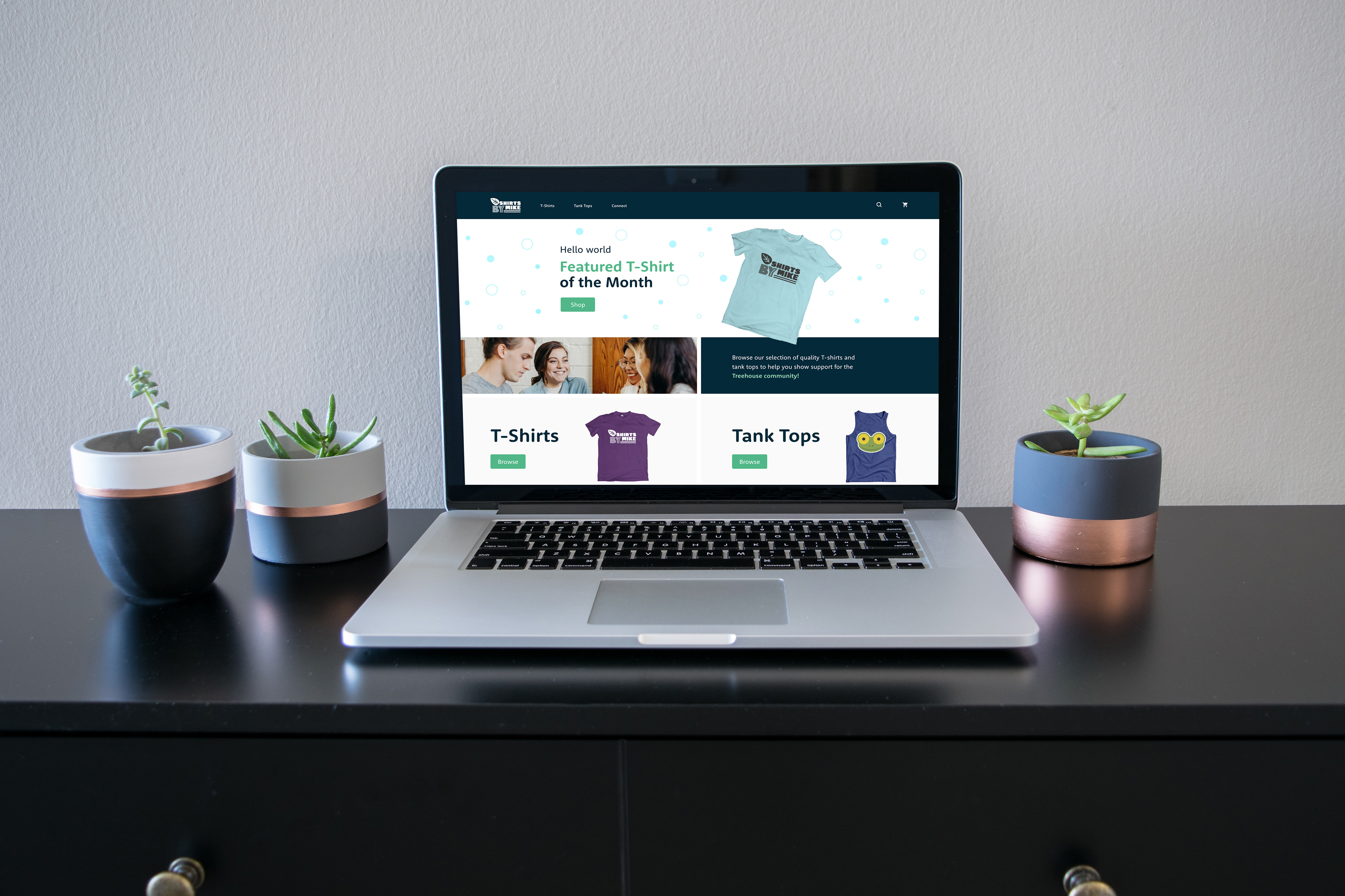
The purpose of the personal project was to help strengthen my UX design skills for designing a responsive e-commerce website. The project brief came from a Treehouse course I took and the main goal of the project itself was to redesign a T-shirt site called Shirts by Mike. The redesign focused on including a featured T-shirt of the month and help Treehouse coding students feel connected to the community.
Approach
Approaching the design, I wanted to give users a sense of being involved in the Treehouse community. Below is the UX content strategy and personality I aimed towards to help achieve both the site goals and provide value to customers.
Friendly and Approachable Personality: I wanted the brand personality to lean more on the friendly and approachable side, in order to help customers feel welcomed and connected to the community. Additionally, I focused on keeping the personality and visuals neutral enough to prevent the customers from being distracted and missing the site goals.
Inspirational UX Content: I felt that utilizing inspirational content would add value to the audience because they are students and want to be a part of a community of people learning how to code.
Descriptive UX Content: I used descriptive content to help provide more information and transparency for the t-shirts. That way the audience has enough information to confidently make a purchase without interacting with the t-shirt in real life.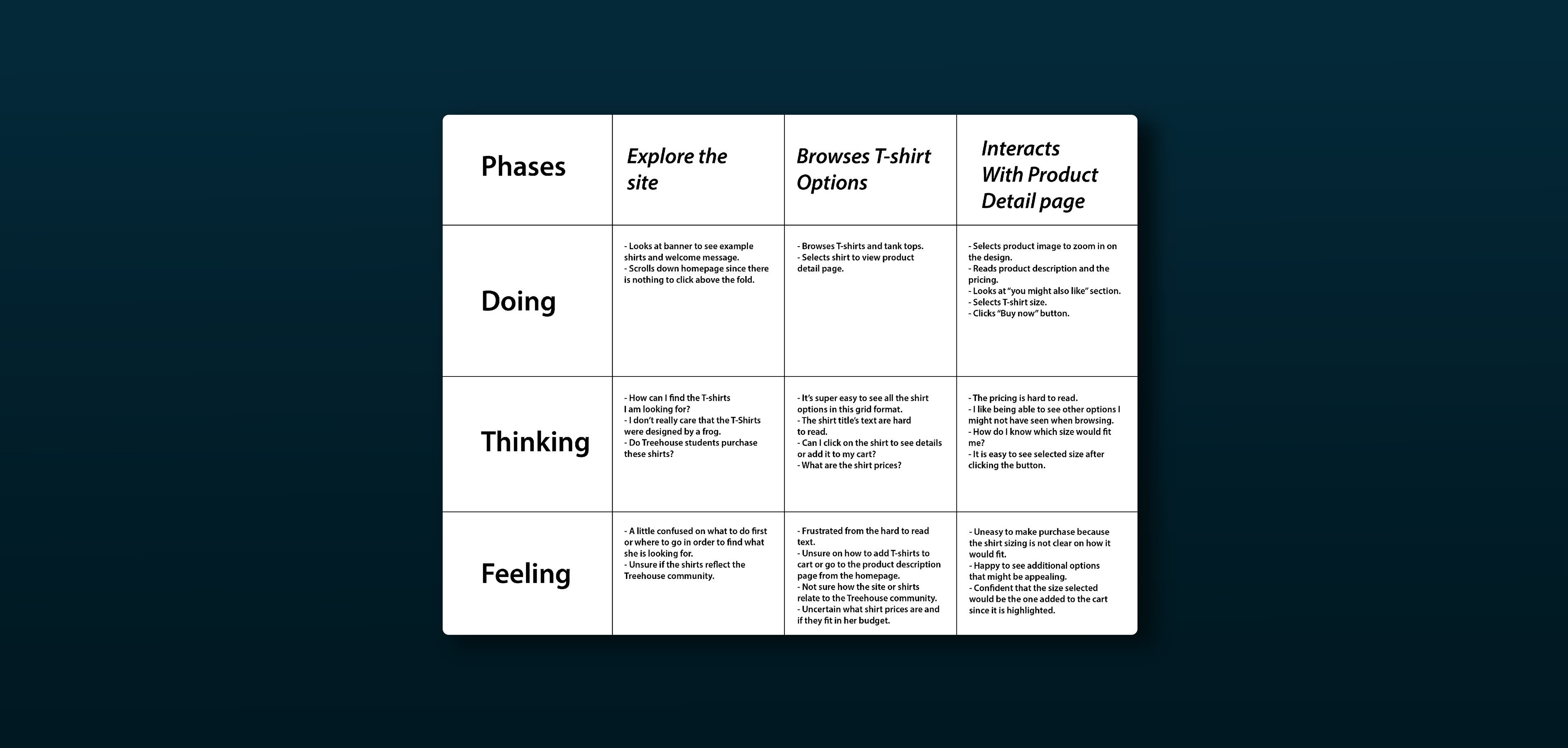
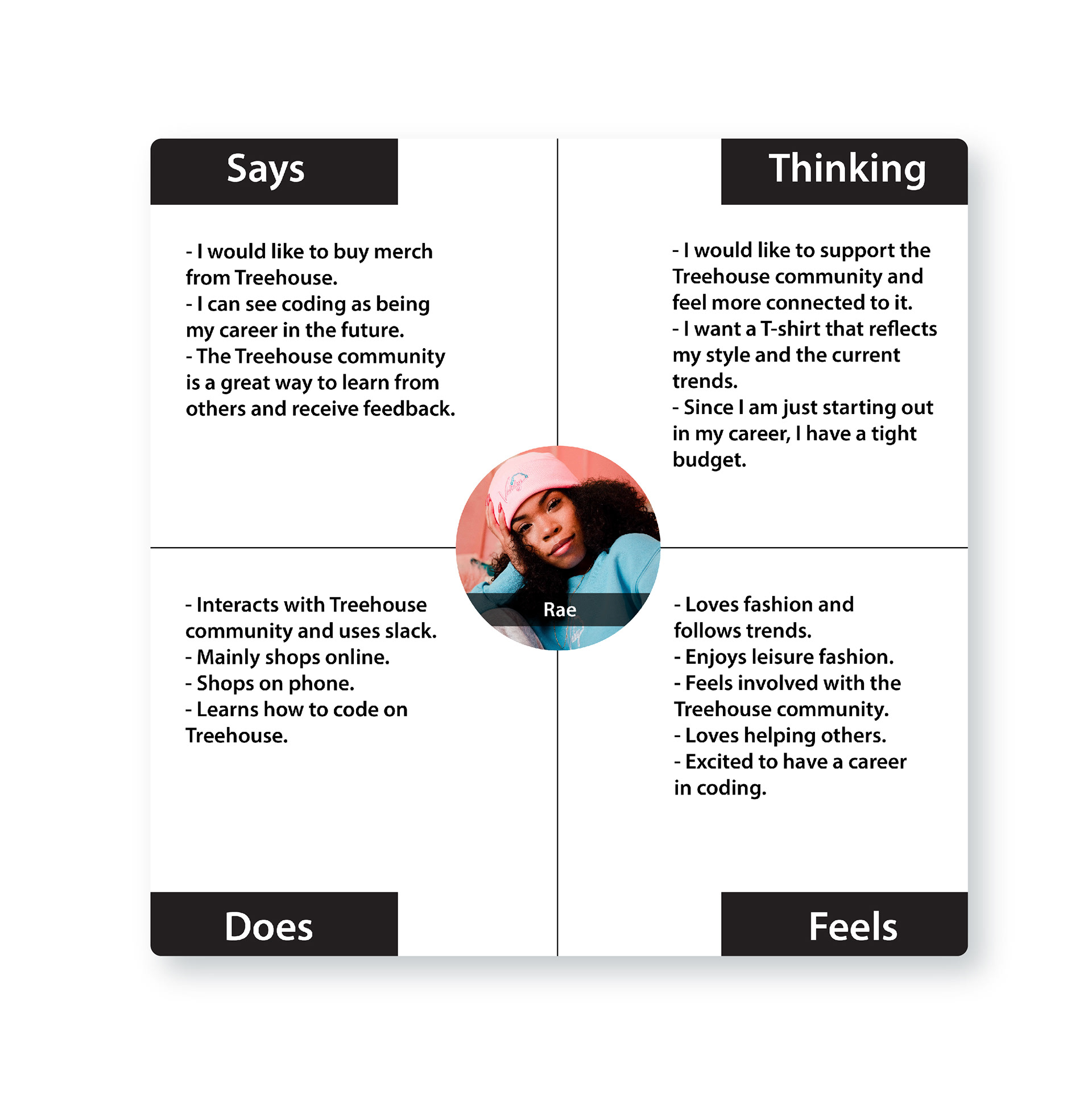
Understanding the User
Based on user research provided to me by the project brief. I created a user persona, empathy map, and journey map to gain a better understanding of the Shirts by Mike target user. By creating these UX documents, I gained a more empathetic perspective of how the users are thinking and interacting with the website. That way I can design for the user with empathy and provide a positive experience on the site.

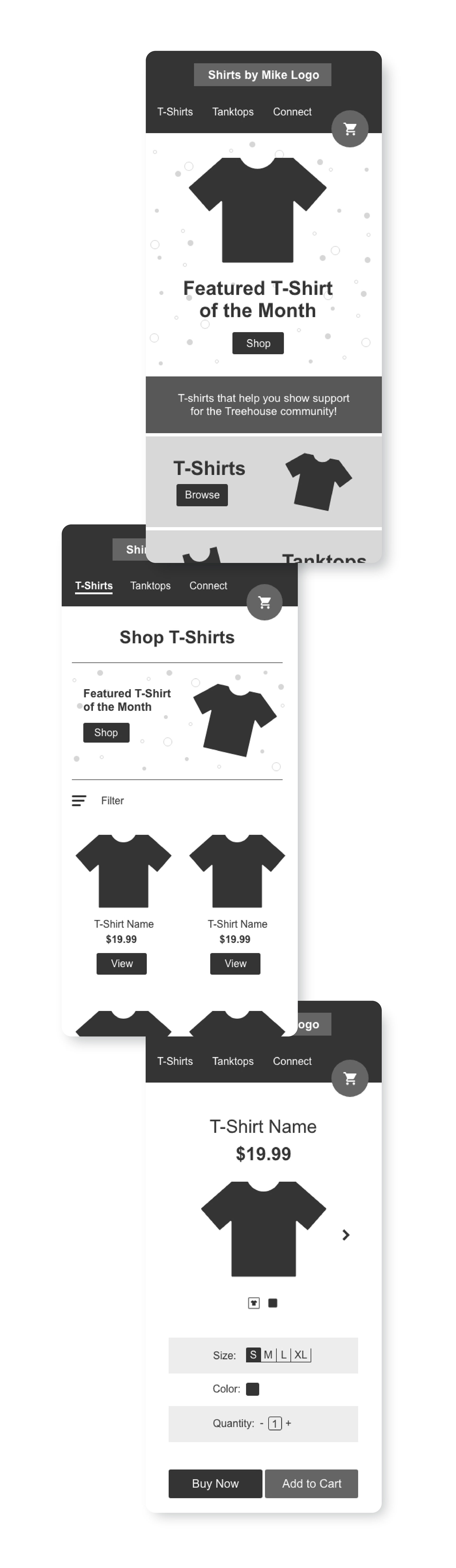
Low Fidelity Wireframes:
I created low fidelity wireframes to figure out the structure, user flow, and information architecture of the website. I started with designing the mobile wireframes first and then moving into desktop because it is easier to add elements to a design than to subtract elements from a design. Below are the main elements I focused on.
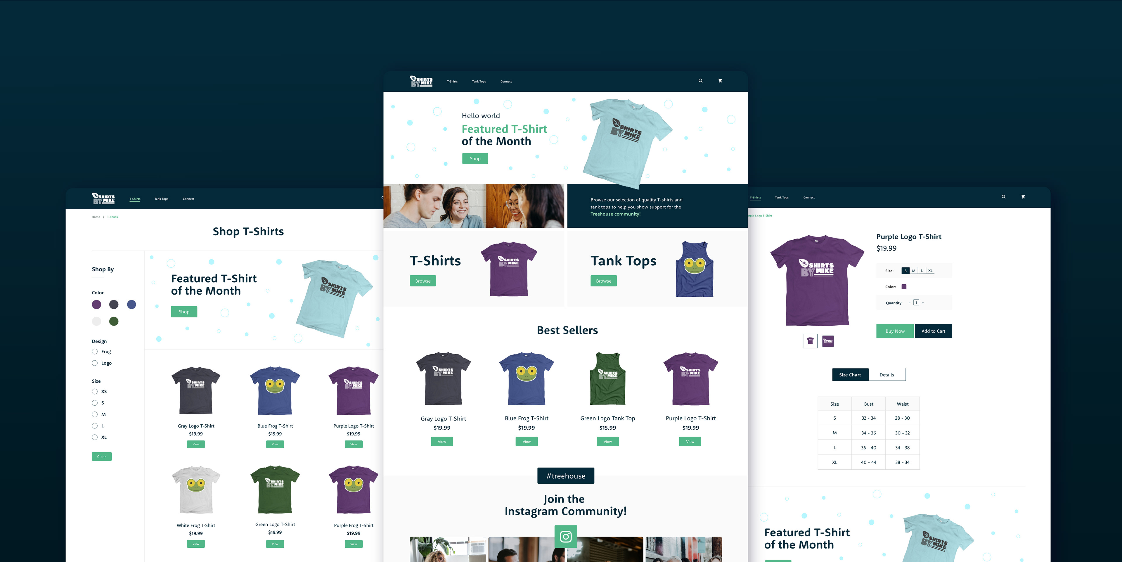
Highlighting the featured t- shirt of the month: I addressed the brief goal of increasing sales and utilizing a featured t-shirt of the month, by making sure to keep the t-shirt of the month above the fold on the home page and t-shirt catalog page. Also, to help make the featured t-shirt more exciting I added confetti like graphics to help hype up the t-shirt more and appeal to the customer.
Instagram gallery on the homepage: In order to help the user feel inspired and excited to support the Treehouse community by purchasing t-shirts, I created an instagram section towards the bottom of the home page. The gallery displays Instagram images of Treehouse students who used the #treehouse tag so their images can be reposted on the Treehouse instagram. The images consist of students collaborating and working on coding projects, which builds a relatable and inspirational connection to the website target user.
Digestible catalog overview on the catalog page: To help the user find what they are looking for easier and quicker, I designed the catalog page to present multiple shirts at the same time while the user is scrolling. That way the user can gain an overall understanding of what designs are within the catalog and they can compare the shirts to help make a decision.
Since customers are not able to physically interact with the t-shirts in a digital space to gain a better understanding of the product. I wanted to provide a size chart to help the customer make a decision on what size they need. Providing this kind of helpful content can help make sure the customer is provided a great experience and reduce returns and negative reviews.
Mobile Layout:
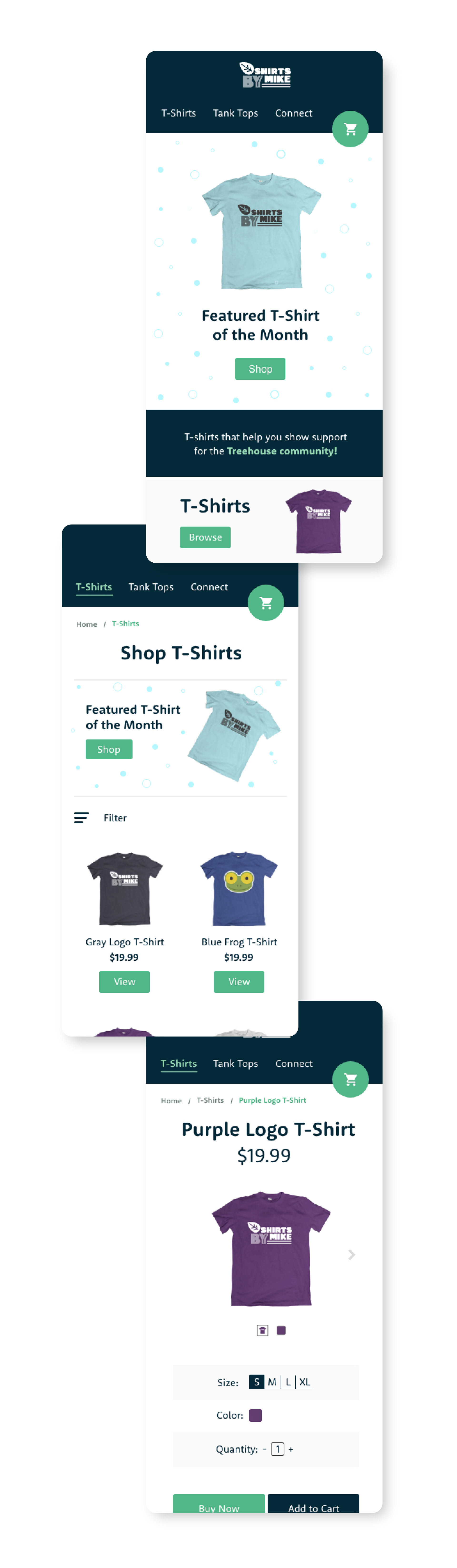
Since the target user is younger and has a strong interest in digital technology, I wanted to make sure the website was optimized for mobil devices. Below are the elements I utilized to make the site mobile friendly.
Compressing the grid: One of the design decisions I made to make the website mobile friendly was compressing the grid to 1-2 columns to help make sure the design elements were comfortably displayed on the phone screen. In order to help compress the grid I removed elements that were not a high priority to be displayed on the website such as some lifestyle imagery or not displaying all the filter options on the catalog page.
Simplifying the navigation bar: I made some changes to the navbar in order to better optimize for mobile. One of the changes was removing the search icon to eliminate overcrowding the navigation. The other change was morphing the shopping bag icon into a floating action button, so as the customer scrolls, the bag will follow them. That way the customer can conveniently complete their purchase once they are done shopping.
Design Development:
Once I finalized the low fidelity wireframes for both desktop and mobile, I shifted into creating high fidelity mockups of the website. I focused on incorporating imagery, color, typography, and graphics to build the brand personality and develop the UX content strategies.
Color: The main goal for the color palette I built was to create a sense of familiarity with the Treehouse brand. That is because the target audience are Treehouse students and their goal is to buy t-shirts to help them feel connected and support the Treehouse community. So having colors related to the Treehouse brand builds trust with the audience and shows that the shirts are aligned with their goals.
Typography: The font I utilized is RooneySans, which is a rounded sans serif that has a high x-height for easy readability. The round characteristic aids the friendly and approachable brand personality. Additionally, similar to the color palette strategy, I wanted a font that was closely related to the main Treehouse font to help increase the trust of the audience.
Imagery: Since the target audience age range is 16-35, I focused on photos that present individuals between that age range so the imagery is more relatable to the user. Another aspect of the imagery I tried to present was collaboration, fulfillment, and focus to help inspire the users to reach their end goal of becoming more involved with the coding community and being successful in their careers.
Final Thoughts
While designing the Shirts by Mike site, I learned quite a bit such as gaining a better understanding on utilizing user research documentation exercises to build user empathy. Additionally, I learned the standard proportions for typography, images, and shapes within the desktop and mobile formats of the website. During the wireframe phase, I designed many of the elements bigger than they should be. After referencing the competitors and other sources of inspiration, I was able to know how the standard proportions should be.
There are a couple of things that I would add to make the project stronger. Such as creating a tablet version to provide more flexibility for the responsiveness of the website. I would also like to take a deeper dive into the instagram images and photoshop the Shirts by Mike designs to create a stronger community story for the brand.
One thing that I would do differently would be allowing additional space in the top header of the mobile mockups. As I was designing the mobile mockups, I did not consider the speaker bar that overlaps the screen for the newer iPhones. In the future I will be more aware of that and make sure to consider it in future mobile designs.