Peek'n Peak Brand Design
Personal Project
Company: Peek'n Peak Resort
Project Type: Logo Design & Branding
The Goal
PEEK’N PEAK IS A WINTER AND SUMMER SEASON SKI RESORT that has activities for both seasons. In the winter they have skiing, snowboarding, and snow tubing. The summer consists of golfing, zip-lining, and tree obstacle courses. Overall, the goal was to create a brand design that can easily transition and represent both seasons.
Approach
After doing some brainstorming and research I found a common middle ground that activities of both seasons embrace, which are the mountains and the trees. For winter, snowboarders and skiers use mountain trails that are wooded and nonwooded depending on their skill level and interests. For summer, those natural elements are highly utilized for tree obstacle courses and ziplining.
By finding that middle ground I was able to create a single brand design concept that can easily transition between both seasons without having to build a brand system with two routes of visuals representing both seasons.
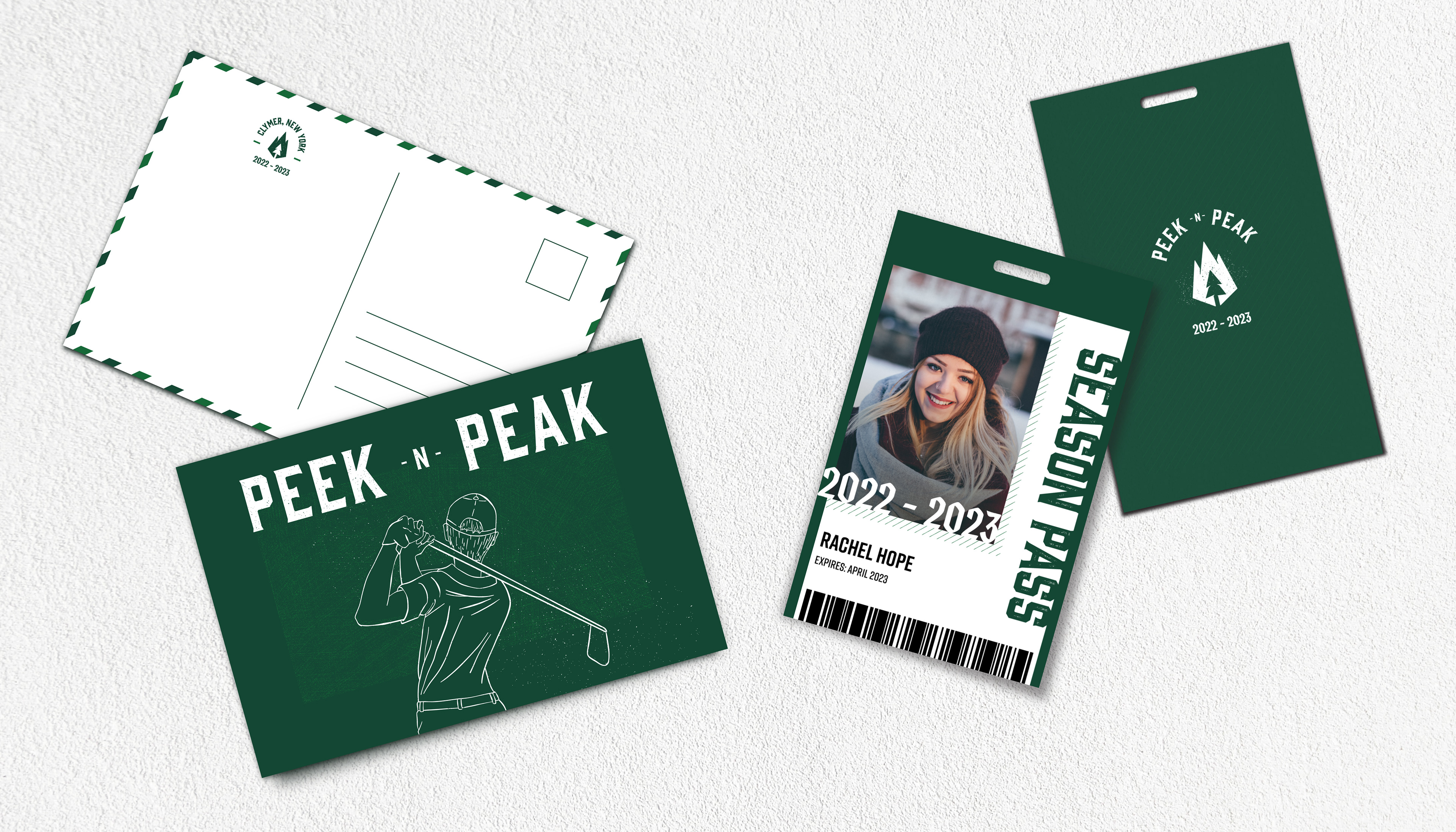
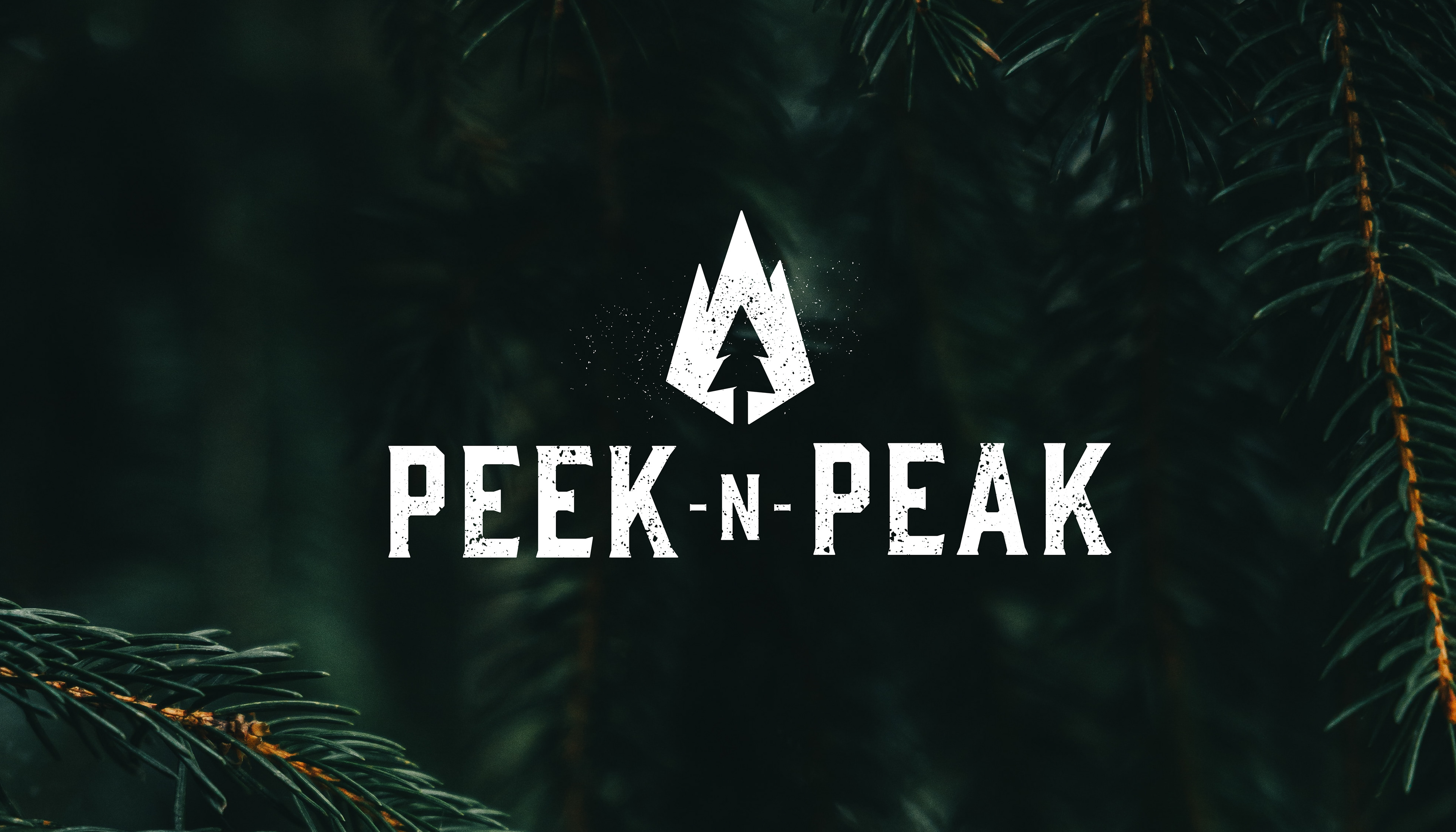
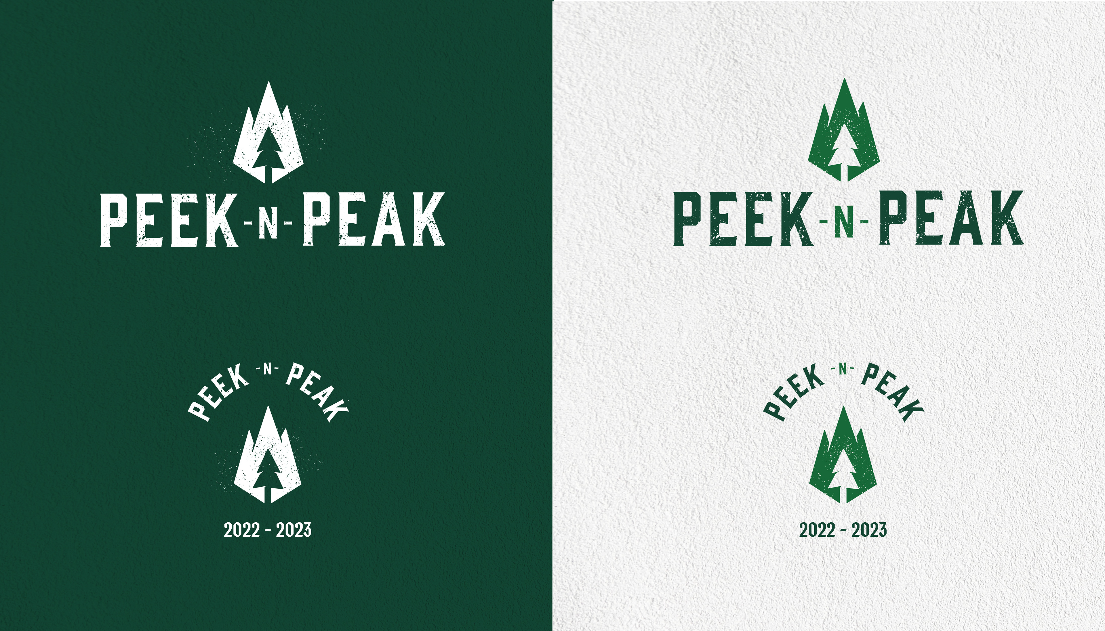
Logo Suite
For the logo design, I decided to use a combination mark, which combines the use of a symbol and logotype. Both the symbol and logotype can be used together and separately. Giving the brand mark versatility opens many logo application opportunities across print and digital to help build brand recognition for both new and regular customers.
Logo Symbol: I utilized the figure-ground Gestalt principle to create a simple mark that represents both mountains and trees, which are the core elements that resort activities in both seasons utilize.
Logotype: The logotype is very strong and sturdy, while inviting a sense of classy, rustic aesthetic. By using a bold typeface, the logotype can easily stand out and support textured elements to further represent the outdoor activities the resort provides.
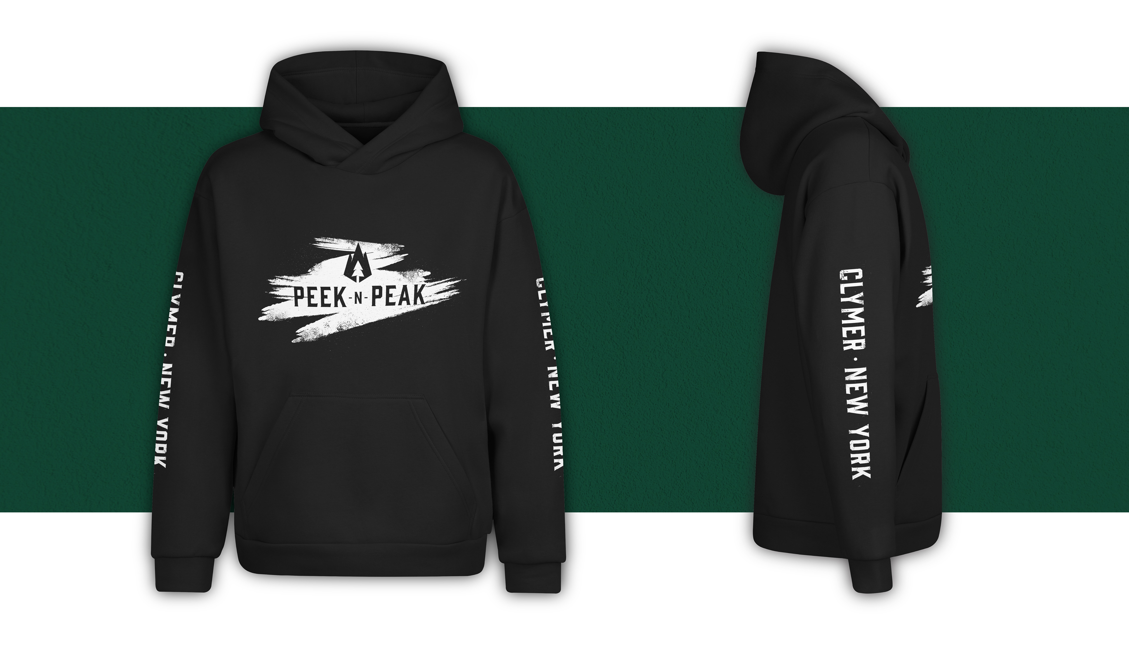
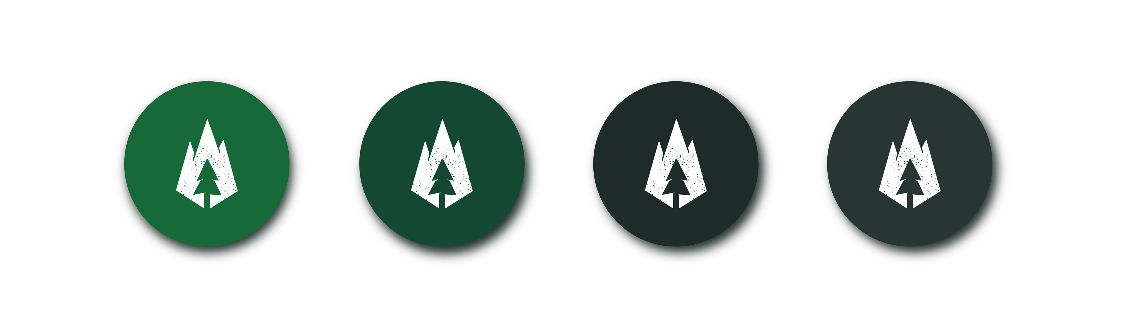
Color
I wanted to use the color green as the dominant color since it is the core color that represents the outdoors. The majority of activities at Peek’n Peak are outdoors, so I made sure that was clearly communicated. As for the type of green, I used warm and cool greens that closely represent pine trees.
The supporting gray colors include hints of green to synchronize well with the overall green color palette. These colors are used to help add contrast, typically for body copy that lives on a light background.
Typography
I wanted to use typefaces that inspired a certain kind of welcoming, old fashioned charm.
Header: Gin by Fort Foundry - This header typeface lays out a strong foundation anchoring the viewer's eye as they read content.
Subheader: Cinder by Fort Foundry - Cinder allows an additional accent to Gin since it has more stylistic characteristics.
Body Copy: Skolar Latin by Rosetta Type Foundry - This typeface can also be used as a subheader if the use of Cinder is too much for the application. Skolar Latin is a solid serif with a satisfying x-height to allow for readability, but does not overwhelm the proportions of the letters.

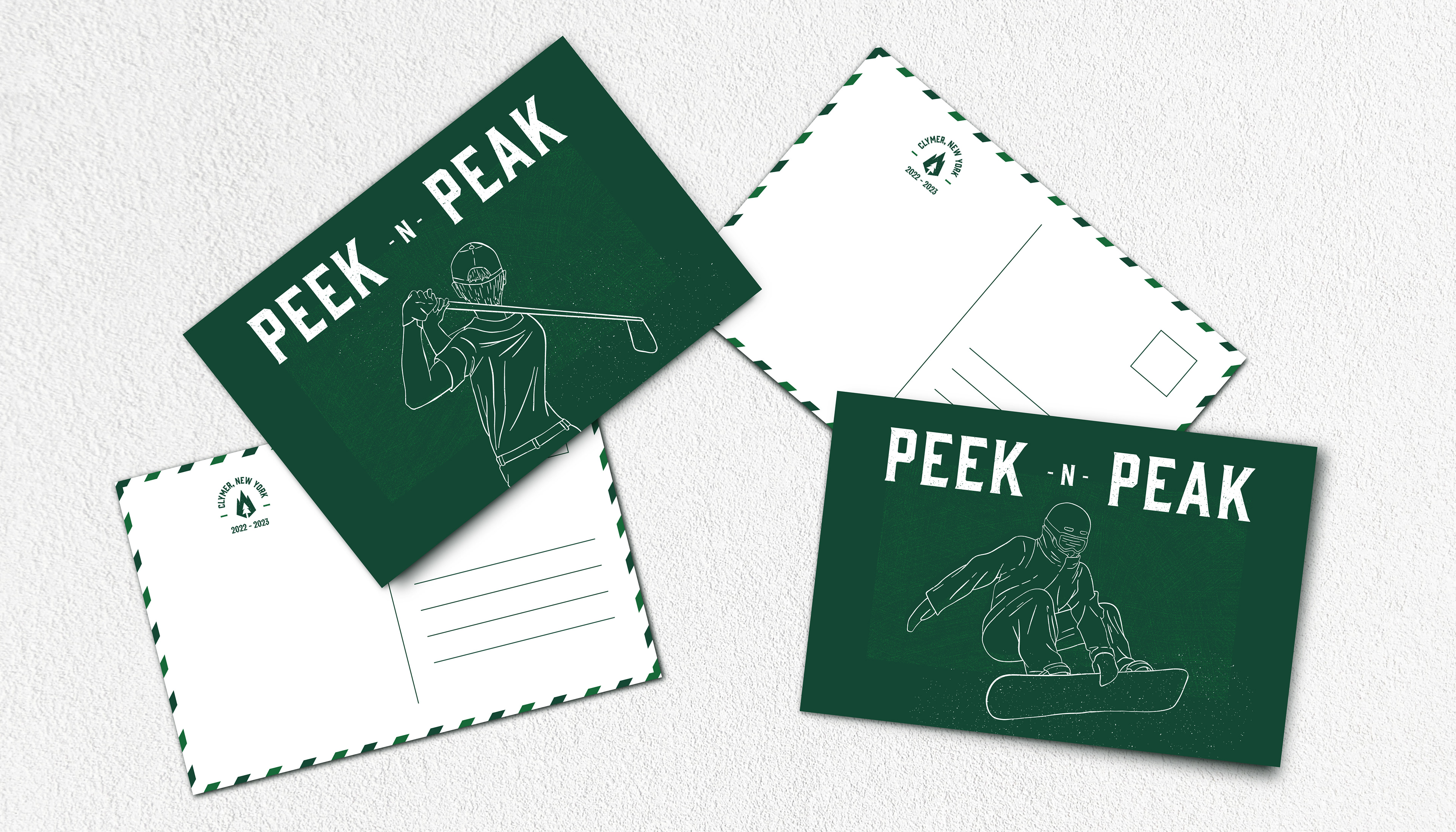
Illustration and Texture
The illustration and texture throughout the brand work together to help create a sense of motion and adventure. They are perfect accents to help make the brand visuals more engaging to the audience and fully communicate an exciting experience by visiting Peek’n Peak.