

Join Our Team Instagram Post Template
Company: Code3
Role: Designer
Project Type: Marketing Design, Instagram Post Design
Collaborators: Senior Designer, Social Media Manager
Goals
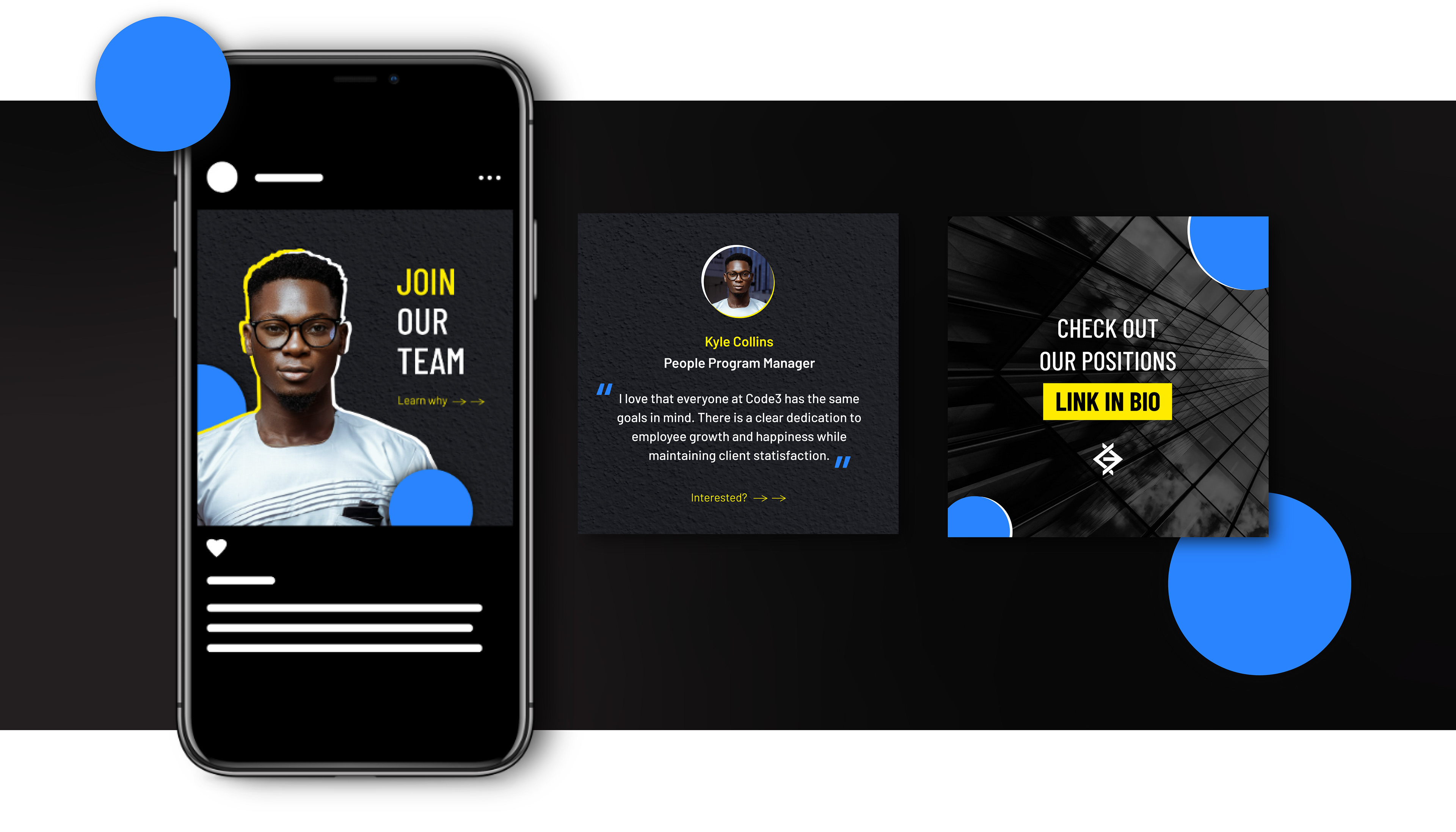
The GOAL OF THE PROJECT was to create an Instagram campaign to promote that Code3 is hiring multiple positions within the agency. The content of the campaign needed to consist of testimonials from multiple employees within the company to help create connection and trust. The Code3 marketing team also wanted to start heading towards an image-heavy approach for the Instagram grid to provide more of a human-focused front for the Code3 brand.
Approach
I decided to utilize an Instagram carousel format to promote a photo-heavy opening for the Instagram grid. The first image would display the face of the employee who gave the testimonial, the second image housed the testimonial, and the last image provided the CTA on where to find the job openings. This approach provided the opportunity to add more text-heavy info within the secondary imagery, while still having the first image be photo-focused.
Additionally, I made sure the graphic elements were simple and consistent. The simplicity helped make sure that I could use the design as a template for additional testimonials.
Design Development
When creating the template, I made sure to follow the Code3 brand guidelines, while still finding ways to allow the design to stand out within the Instagram grid. Below are some of the design strategies I utilized while executing the design.
Organic Shapes: In order to create something that sticks out, I kept the Gestalt Principle focal point in mind. The focal point principle is whatever visual element looks different, compared to the other visual elements within the design, will hold the viewer’s attention first. Many of the previous designs took on more square, rectangular, and angular elements. So I decided to utilize the organic profile of the person within the photo and layered it with circle shapes to break out of the rectangle aesthetic and utilize the focal point principle to help the design stand out from the grid.
Layered image elements: Layering helped create depth and interest within the composition. I took advantage of the scrapbook approach by cutting out the person within the image and added accent graphics to help bring forward the Code3 brand. This allowed the photo to blend into the design seamlessly.
Texture: Instead of using a flat color for the background I wanted to push the depth created by the layered elements with a textured background. To make sure that the texture did not overwhelm the design, I decided to go with a dark concrete wall texture that is still interesting enough to add to the composition but keeps its place within the background without competing against the design in the forefront.
Final Thoughts
Overall the design template worked pretty well as I created other versions that utilized different photos and testimonials. The simplicity of the design really helped to make sure that whatever photo I was given could easily fit into the design. I did notice that photos with a black background were the easiest to clip through the scrapbook approach, but images with more colored backgrounds needed to be clipped directly onto the person’s profile to keep the background from showing because it clashed with the design too much.